Step-by-step full guide to choosing great font pairs

1. Understand the Basics of Typography
- Font vs. Typeface: A typeface is the design of the letters (e.g., Arial), and a font is a specific style within a typeface (e.g., Arial Bold).
- Serif vs. Sans-Serif: Serifs have small lines at the ends of characters (e.g., Times New Roman), while sans-serifs do not (e.g., Helvetica).
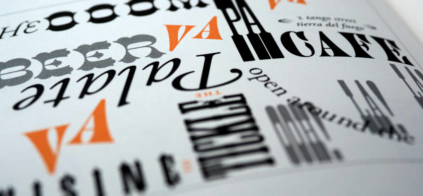
- Other Types: Slab serifs (thicker serifs), script (handwritten style), and decorative fonts.
2. Define Your Project's Purpose and Audience
- Purpose: Is it for a formal report, a casual blog, a wedding invitation, or an advertisement?
- Audience: Who will be reading it? Professionals, students, or the general public?
3. Choose a Primary Font
- Readability: Select a font that is easy to read, especially for body text. Generally, serif fonts are preferred for print, and sans-serif fonts for screens.
- Tone: Match the font’s tone to your content. A formal document might use Times New Roman, while a tech blog might use a modern sans-serif like Roboto.
4. Choose a Secondary Font
- Contrast: Select a secondary font that contrasts with the primary font but still complements it. Contrast can be achieved through differences in weight, style (serif vs. sans-serif), and size.
- Function: Typically, the secondary font is used for headings, subheadings, or accent text. It should stand out but not overpower the primary font.
5. Test Font Pairs
- Legibility: Ensure both fonts are legible at various sizes and weights.
- Compatibility: Check if the fonts look good together by pairing them in a sample text. Create a mock-up of your project to see them in action.
6. Use Font Pairing Tools
- Online Tools: Use tools like Google Fonts, Font Pair, or Typewolf to explore recommended font pairs and see them in action.
- Inspiration: Look at other designs in your field for inspiration. Analyze what works and why.
7. Check for Licensing
- Commercial Use: Ensure you have the right licenses for the fonts if your project is commercial. Some fonts are free for personal use but require a license for commercial use.
8. Consistency Across Media
- Print vs. Digital: Some fonts are designed specifically for print or digital use. Ensure your chosen fonts work well in the medium of your project.
- Cross-Browser Compatibility: For web projects, make sure the fonts render correctly in different browsers.
9. Typography Hierarchy and Layout
- Hierarchy: Establish a clear hierarchy using different font sizes, weights, and styles. Headings should be distinct from body text, and captions should be smaller.
- Spacing: Pay attention to line height, letter spacing, and margins to ensure readability and aesthetic appeal.
10. Refine and Iterate
- Feedback: Get feedback from peers or your target audience. They might notice things you missed.
- Adjustments: Be ready to tweak your choices based on feedback and final testing.
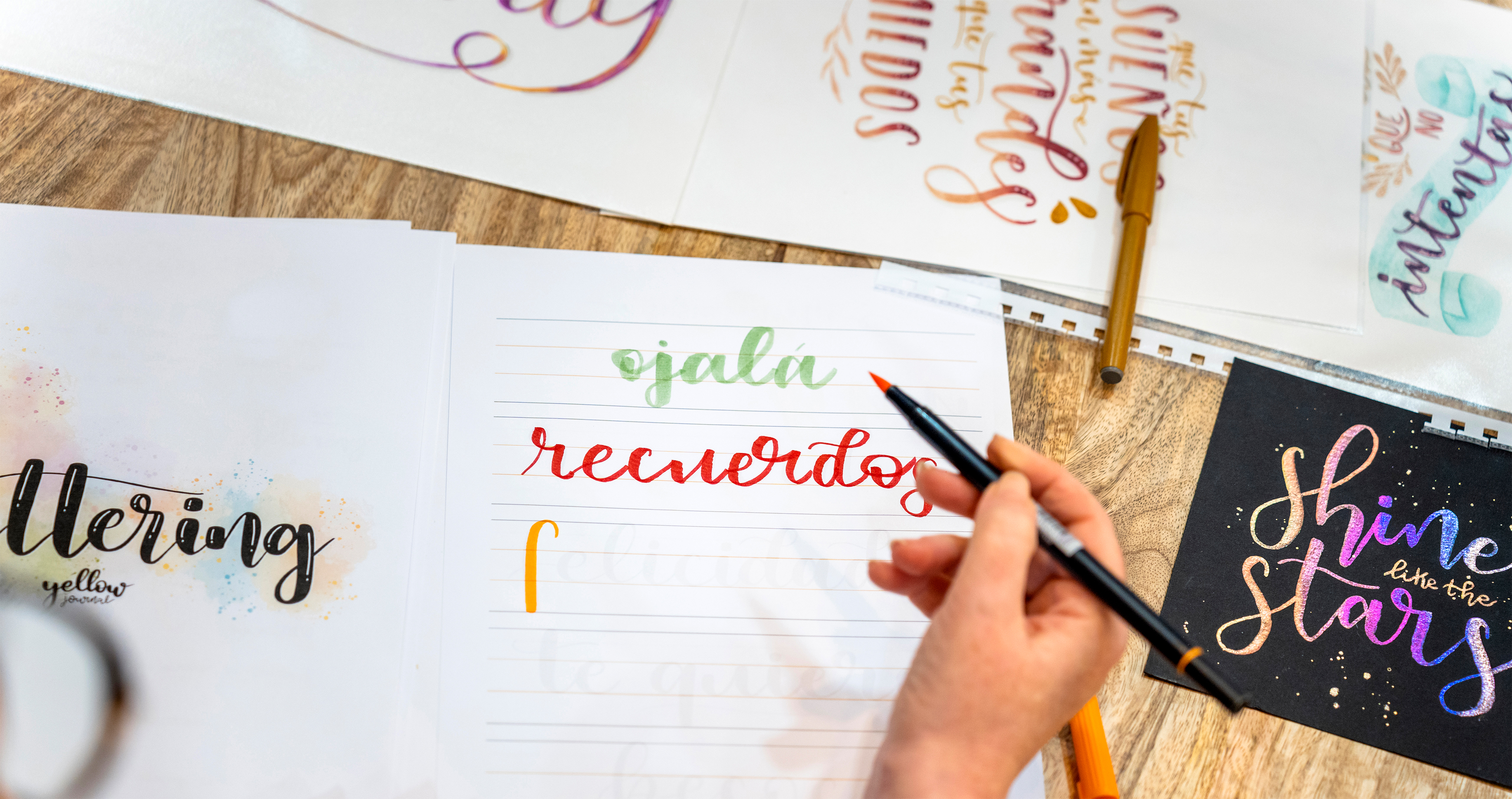
Example Font Pairs
- Serif + Sans-Serif: Georgia (body) + Helvetica (headings)
- Sans-Serif + Sans-Serif: Roboto (body) + Open Sans (headings)
- Serif + Serif: Merriweather (body) + Playfair Display (headings)
- Decorative + Sans-Serif: Pacifico (headings) + Lato (body)
Final Tips
- Keep It Simple: Avoid using more than two or three fonts. Consistency is key.
- Mood and Message: Always ensure that the fonts match the mood and message of your project.
- Flexibility: Be flexible and open to experimenting until you find the perfect pair.
By following these steps, you'll be well on your way to choosing font pairs that enhance your design and effectively communicate your message.